DTF Printing on Dark Fabrics: Isolate the Cause Before You Adjust Settings

A faded print on a black shirt usually gets worked on in one of two places: the heat press, or the white ink settings in the RIP. Density goes up, a second white pass gets added, the shirt is pressed again — and sometimes the colour comes back.
Sometimes is the problem. Change two variables at once and the shop learns nothing about which one was responsible.
DTF printing on dark fabrics has four moving parts that can each produce a similar-looking result: the white ink system, the RIP and its colour management, the film coating, and the press and peel. A symptom that reads as "weak white" can begin in a place no setting will reach.
What follows is an order to check them in, not a list of fixes: how the transfer is actually built, what each variable governs, and four tests that eliminate one at a time. Where published numbers disagree, it shows how to build your own baseline instead. Two neighbouring questions are left out — film selection, and a general catalogue of transfer defects.
Why Dark Fabric Resets the Whole Equation
CMYK inks are translucent pigment films, not opaque paint. Put them straight on a dark ground and the fabric absorbs most of the light that reaches it, so the colour has very little to work with. This is not a tuning problem and no amount of colour ink resolves it.
A DTF transfer solves it by carrying its own reflective layer: an opaque white layer sitting behind the colour, blocking the garment and bouncing light back through the ink film. Everything about how the print reads — brightness, saturation, whether a red looks red or maroon — comes back to that layer.
How the stack is built is where most explanations go wrong, so it is worth being precise. On the film, the printer lays down CMYK first and white over it. Roland DGA’s production walkthrough states it plainly: "After the colors are printed using CMYK inks, white ink will be printed over the design as a base layer for transfer and opacity." Film manufacturers write the same instruction into their own product documentation, often as nothing more than CMYK >> White Ink in a four-line how-to-print list.
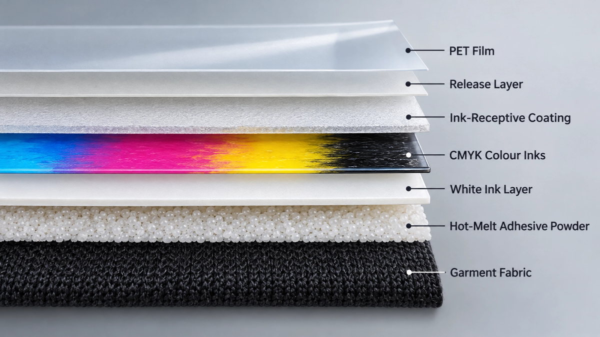
White is printed last for a second reason beyond the layer order. Hot-melt powder is applied while the ink is still wet and bonds to whichever ink surface is exposed — which, in the standard CMYK-first workflow, is the white. The white layer therefore does two jobs: the opaque barrier behind the colour, and the surface the adhesive bonds to.
Flip the transfer, press it face-down, and the order inverts as designed. On the garment, from the fabric outward: fabric, adhesive, white, colour.
That inversion is why so many guides say the white layer "goes down first." On the finished garment that is true — white is closest to the fabric, and the colour you see is the outermost layer. In the printer’s firing order it is not. Two different sentences, routinely collapsed into one.
White Ink Is a Harder Ink Than the Other Four Channels
White ink is the least stable material in the machine, and for a physical reason. Its opacity comes from pigment — titanium dioxide is the usual one — and that pigment is far denser than the liquid carrying it. Whenever the ink stops moving, gravity pulls it down.
Equipment manufacturers design around that fact rather than solving it. Epson’s DTF printer documentation lists white ink circulation among its maintenance systems and describes the purpose directly: preventing clogging and sedimentation. Industry reporting on the same machines notes that even with recirculation built in, a daily agitation of the white ink supply is still advised, and that the design allows the bag to lie flat to reduce how deep any settled layer gets. M&R, which makes both equipment and consumables, puts the consequence bluntly in its production guidance: white ink is where most problems start, and unstable white ink means clogging, inconsistent coverage and constant maintenance.
For a shop running dark garments this lands differently. On a light shirt the fabric supplies the white behind the colour, so a slightly thin white layer is largely invisible. On dark fabric that layer is the only thing between the colour and a light-absorbing background — and dark work is where the white channel is asked for the most ink.
The consequence is the one that is hardest to accept: white opacity is not a constant of the machine. It drifts with idle time and maintenance state, so the same file and the same fabric can produce two different results on the same printer in the same week.
Four Variables, Four Different Symptoms
The four variables below can each leave you with white that is faded, patchy or incomplete. The symptoms overlap. The mechanisms do not.
One principle governs the whole table, and it is the reason the tests in the next section are worth running: a setting changes how much white the job asks for. It cannot change where, or how evenly, that white lands. White density in a RIP is a single number applied across the whole image; it can compensate for a shortfall in quantity and it cannot compensate for a shortfall in distribution.
| Variable | What it governs | What it looks like when it is the cause |
|---|---|---|
| White ink system — ink, lines, dampers, printhead | How much white reaches the film, and whether every nozzle fires | White that is uniformly thin or translucent; banding inside the white layer; worse after a weekend or a long idle period |
| RIP and colour management | How much white the file asks for, where it is placed, how far the white edge is pulled back, and how artwork transparency is interpreted | White that stops short of the colour edge or spills past it; a soft or feathered design printing with thin white while hard-edged areas look fine; one design weak, the next one on the same roll fine |
| Film coating | Where the ink droplets land and how well they are held — dot placement, ink limit, and uniformity across the sheet and along the roll | Patchy or mottled white rather than uniformly thin; two films, identical settings, visibly different results; variation across the width of a single roll |
| Press and peel | How completely the film releases and how far the layers fuse | A print that looks acceptable and then changes after a second press; detail lost at the edges; a dull surface rather than a weak one |
One term in that table needs defining, because it is the most common cause of a white halo. In an underbase workflow, the RIP shrinks the white layer slightly relative to the colour artwork — a few pixels inward from the colour edge — so that no sliver of white peeks out once the transfer is pressed. CADlink’s Digital Factory documentation describes the setting as tightening the underbase "by a specified pixel amount." Push it too far and thin details lose their white entirely; leave it too shallow and the design gains a white outline.
Isolate Before You Adjust — Tests That Rule a Variable Out
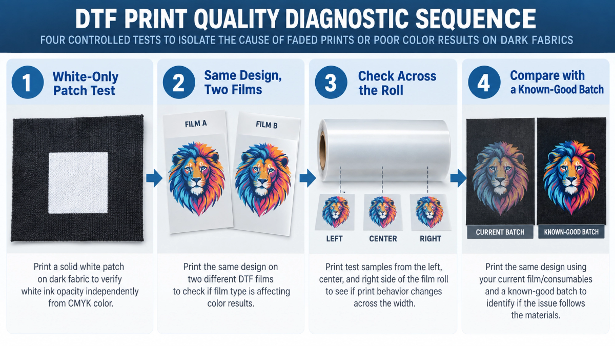
These four tests have one rule in common: change a single thing, and know in advance what each possible outcome means. None of them is a fix. Their job is to remove a suspect so you can stop guessing.
1. Print a solid white patch with no colour in it. A filled block, no artwork, no colour layer. An even patch means your ink system is delivering and the suspect moves to the RIP or the film. A mottled, banded or unevenly light patch means the problem sits upstream of anything your artwork or density setting can fix.
2. Run identical settings on two films. Same file, same queue, same press, same fabric — only the film changes. If the second film produces visibly stronger or more even white, the coating has been isolated. Small formats make this affordable, and A3 and A4 DTF film sheets cost little per test.
3. Sample across the roll, not just one spot. Coating is applied across the full web, so the question is whether your film is uniform — not whether one square inch of it is good. Print the same patch on samples cut from the left edge, the centre and the right edge of one roll, and compare.
4. Keep a known-good sheet back. Hold on to one dated sheet from a batch that produced acceptable work. When a problem appears, print the same design on it at your current settings. This is the only test that separates "the film changed" from "something in my shop changed," and it costs one press cycle.
Write down what each test showed — date, film batch, white density, press temperature and time, result. The object is to finish with a reference you can still compare against in three months.
What the Film Side Actually Controls
If the tests point at the film, it is worth understanding why film can affect white coverage at all. DTF film is a PET base with coatings, and pigment ink does not sink into it. The droplet lands on the coated surface and has to stay where it lands.
Contact angle. Whether a droplet sits up or spreads out is set by the surface energy of the coating. In Specialist Printing Worldwide, M&R’s Zac Biberstine states the objective plainly: drops "need to sit precisely and stand taller to achieve better opacity and more vibrant whites." A drop that spreads flatter covers more area with less height, and a thinner white layer reflects less light back through the colour above it. That is the chain from film surface to white opacity, running underneath every setting in your queue.
Uniformity. The same source is specific about why variability matters: uniform coating thickness "ensures predictable ink behaviour," while "variations in coating can cause differential absorption, leading to banding, colour shifts or inconsistent curing and release." Differential absorption is why a coating problem rarely shows up as a print that is evenly pale: the deficit varies with position, so the white layer inherits it as mottling that follows a band or a zone.
Ink limit. Low-quality film is described in the same discussion as producing dull, inconsistent prints with a limited ability to colour match, while consistent ink limits keep whites bright. In production terms, a film sets a ceiling on how much ink its coating can hold, and raising white density in the RIP does not raise a ceiling the coating sets. That is the mechanism behind a setting that "used to work" perfectly well on another film.
Release. Coating uniformity applies to the release layer as well, and inconsistent release can either leave residue or hold part of the design on the film. Peel behaviour is a film specification rather than an operator preference; the mechanism behind hot peel vs cold peel is covered separately.
A DTF film roll is coated across its full width, which is why test 3 samples left, centre and right rather than one position: in production what matters is consistency along the roll, not one good square. Confirming the film as the variable is where this article stops; once the film is the answer, the next question is how to choose the best DTF film for your work.
Two Things That Look Like White Ink Problems but Aren’t
Both of these present as weak white, and both sit outside the production chain entirely. Recognising them saves a day of adjusting settings that were never at fault.
Artwork transparency is an instruction to the white channel. In an underbase workflow the RIP generates white from the opacity of your artwork: a fully opaque area gets full white, and a semi-transparent pixel is read as a request for partial white. Drop shadows, outer glows, feathered edges and washed-out watercolour effects therefore print with less white than the rest of the design, and on a dark garment they look faded while everything around them looks correct. What identifies this one is its shape — the weakness traces an element in the file, not a band on the film. The correction is in the artwork: make the effect fully opaque or remove it.
Dye migration on polyester. Polyester is dyed with disperse dyes held inside the fibre, and press heat can re-activate them: the dye turns gaseous and moves up into the ink film, turning white and light areas pink, orange, grey or muddy. It is a chemical bleed-through, not a mechanical or adhesion failure, and its signature is timing as much as appearance. The print looks correct off the press and shifts over the following hours — published accounts describe changes still appearing up to 48 hours later — and the cast follows the garment’s own colour rather than your design. Risk is highest on heavily dyed and sublimated polyester and rises with temperature and dwell time. The levers decorators reach for first are the low end of the film’s stated temperature range, the shortest dwell that still gives full adhesion, and a pre-press of the blank to drive out moisture.
White-ink and print-generation problems are typically visible before or immediately after pressing, whereas dye migration can keep developing for hours afterwards — and neither of these two will respond to a density setting. Everything else — adhesion failures, peeling, cracking, powder residue, inconsistent release — belongs to a separate family of defects with its own logic: DTF transfer problems and their real causes.
Building a White Ink Baseline on Your Own Equipment
Published white ink settings do not agree with each other, and they are not going to. The workable number depends on the ink limit of your film, your printhead and its condition, the white generation mode your RIP uses, and the fabric underneath. A figure reported under one set of those conditions is a data point, not a target.
| Setting | Range seen in published guidance | Why it moves |
|---|---|---|
| White ink density | Commonly quoted from roughly 70–80% up to 120%+, with some workflow descriptions going considerably higher for heavily saturated work on dark substrates | Film ink limit, substrate darkness, and whether the RIP is generating an underbase or a highlight layer |
| Underbase choke | Most often described in the 1–5 px range | Colour-edge softness, output resolution, and how much edge halo is tolerable on the fabric |
| Press temperature and time | Published bands sit roughly between 130 °C and 165 °C for 10–20 seconds | Film specification, powder grade, and fabric sensitivity — polyester and heat-sensitive fabrics belong at the low end |
Since none of those figures is portable, the useful deliverable is not a number but a baseline. Take the film you intend to run, print a white-only patch and one representative design on the fabric you actually sell, and bracket a single variable at a time — temperature first, or density first, but not both. Record what you settle on and why. Once you have that record, your own numbers outrank anything published, including everything in the table above.
Even a house baseline is a band rather than a point. Our sample presses typically run in the 250–300 °F range, and that band is where our own testing starts — it is not a figure we would hand another shop as a target, because the same film on a different press, at a different platen reading, will want something else. A house band that sits at the lower end of a published one is not a contradiction; polyester and heat-sensitive blends belong there.
Actual settings may vary depending on film, ink, powder, equipment, fabric and other variables.
Conclusion
Nothing here takes the press or the RIP off the list of places a dark-fabric problem gets solved. It changes the order in which they get touched. A density change made after the white patch has already ruled out the film costs exactly what it would have cost before — the difference is that this time you know it was the change that fixed the job, and that knowledge is what carries into the next order.
If you want to run the two-film comparison against what you print today, request a DTF film sample from LorinTransfer and set the same design on your own fabric, at your own settings.
FAQ
Why do my DTF prints look dull on black shirts but fine on white ones?
How do I tell whether the problem is my film or my printer settings?
What white ink density should I use for dark fabrics?
Why does DTF white ink look uneven or patchy on dark fabrics?
Contact Us
Tell us your requirements and our team will get back to you within 24 hours.

Ellen Lin
Product Manager & Heat Transfer Materials Specialist
Ellen Lin is a Product Manager at LorinTransfer, specializing in heat transfer materials, DTF printing solutions, and UV DTF transfer products. With hands-on experience in product development and market research, Ellen works closely with manufacturing teams and printing professionals to improve product performance, application methods, and customer solutions. She shares insights on transfer printing technologies, material selection, and industry trends to help businesses make better decisions for their printing projects.
Related Articles
DTF Transfers for Print on Demand: A POD Seller’s Sourcing Guide
There is a moment in the life of almost every custom apparel store when the numbers quietly stop working. Orders arrive, designs sell — and the fulfillment receipt still shows you keeping five to eight dollars on a twenty-five dollar shirt.

What DTF Film Can Your Printer Run? Matching Specs by Machine Class
Few purchases fail as quietly as the wrong roll of DTF film. It arrives on schedule, wound neatly on its core, exactly the width the product page advertised — and it does not fit the machine it was bought for.

Hot Peel vs Cold Peel DTF Film: Setting Your Production Standard
It depends. That is where most guides to hot peel vs cold peel DTF film land, and it is not wrong — it is just unfinished.