Matte or Glossy DTF Film? The Term Is Doing Two Jobs

Two people order the same thing and neither of them means it. One asks their supplier for matte DTF film because the last batch of transfers came out shinier than the brand mockup, and they want the finished decoration to sit flat and low-sheen on the shirt. The other asks for matte DTF film for the opposite reason: their roll-fed printer keeps slipping on glossy stock, and they have been told a matte film feeds better.
Same request. Same two words. Two different problems, with two different fixes, and neither buyer is confused about what they want — only about which one the word is pointing at.
That is the whole trouble with matte and glossy in DTF. Each of them is doing two jobs at once. One job is a description of how the film is manufactured. The other is a description of how the finished print looks once it is on a garment. They are not the same property, they are not decided by the same thing, and they do not move together. A film can be built matte on both sides and still produce a print that reads as glossy; a film can be coated on one side only and produce a print that reads as flat.
Everything downstream of that ambiguity — which film to buy, what to put in a spec sheet, what to promise a client — depends on pulling the two apart first. So that is where this starts.
One word, two jobs
Strip the term back and the two jobs are easy to name.
Job one — how the film is built. This is a description of the PET carrier film's coating structure: whether the print side carries an ink-absorbent coating only, or whether the back side also carries a functional coating. In DTF supply, the common shorthand for a film with treatment on both sides is a double-sided film, and — because that second treatment is typically a matte-textured functional layer — it often gets called double matte. A film with coating on the print side alone is correspondingly called single-sided.
Job two — how the finished print looks. This is a description of the surface of the decoration after it has been pressed onto the garment. It is a visual property: how much light the surface throws back at the viewer, how the color reads, how the surface feels under a fingertip. Sheets of it produce low-sheen or reflective finishes; the industry talks about it as matte versus gloss on the printed result.
Those are the two axes. They are both legitimate, both used constantly, and both usually shortened to the same word. Printed on a page next to each other, nobody would confuse them. Said out loud in a supplier email, they collapse.
Keep them separate and the rest of the DTF film conversation gets simpler, because you can now ask which axis a given statement is on before deciding whether it applies to you.
The construction axis: what changes on the line
The construction axis is about behavior during printing, not appearance afterward. A film's coating structure shows up in how it moves through a machine, in how much static it carries, and in how reliably it behaves over a long run.
The print side of any DTF film carries a coating engineered to absorb and hold a heavy ink load — that is what lets a film take white ink without the ink running. Some films treat only that side. Others add a second functional coating to the back, and this is the layer that the word matte usually refers to in the construction sense. Suppliers of double-coated films describe that back layer as doing several jobs at once: reducing static build-up, giving printer rollers more grip so the film feeds without slipping, and preventing the film from blocking or sticking to itself while it sits on a roll.
The static piece matters more than it sounds. When a film accumulates a static charge, hot-melt powder clings to the unprinted areas and can get pressed onto the garment as faint adhesive haze — the kind of defect that shows up worst on dark fabric. An anti-static back treatment reduces that. On a roll-fed system, the same treatment also steadies feeding, which is where the second buyer in the opening paragraph was coming from: what they want is not a look, it is a machine that stops slipping.
The site's own selection guidance covers this axis in more depth — the feed path, the static behavior, the format matching — so it is worth reading how to choose a DTF film if construction is what you are actually choosing between. For this article, the point is narrower and more important: every one of those effects is a production effect. None of them is the appearance of the finished print. A film can be built perfectly for feeding and still come off the press with whatever surface the rest of the process produces. Construction decides how the film runs. It does not decide how the print looks.
That distinction is worth stating plainly because the naming invites the opposite conclusion. A "double matte" film sounds like a film that produces a matte print. It is not — it is a film whose back side carries a coating, and that coating happens to have a matte texture. If the print side's own construction is what you care about, the mismatch matters: a roller-fed shop and a desktop shop can end up buying the same description for different reasons, and one of them is buying the wrong axis.
Films built for roll-fed production are usually sold on exactly this basis — coating structure and back-side treatment, not finished look. The DTF Film Roll range, for example, is specified around a double-sided matte, anti-static construction, which is a statement about how the film feeds and manages static, not about how a finished transfer will photograph. That is the axis where product specifications are usually written, and it is why reading a film spec sheet will not tell you what your print is going to look like.
The appearance axis: what actually makes a print look the way it does
Now the second axis, which is the one most buyers are actually shopping for.
Start with what matte and gloss mean as physical descriptions, because the term is older than DTF and was defined long before anyone printed a transfer film. Gloss is an optical property of a surface: it describes how much light that surface reflects back in the mirror-like, specular direction. A smooth surface sends light back at a matching angle and reads as glossy; a microscopically rough surface scatters that light in many directions, and the eye reads the result as matte. Testing standards treat it this way — a glossmeter fires a beam at a fixed angle and measures the reflected light, and surfaces are graded into bands such as high gloss, semi gloss, and matte according to how much comes back. The matte and gloss of an industrial coating describes surface micro-roughness, full stop; it does not name a product family.
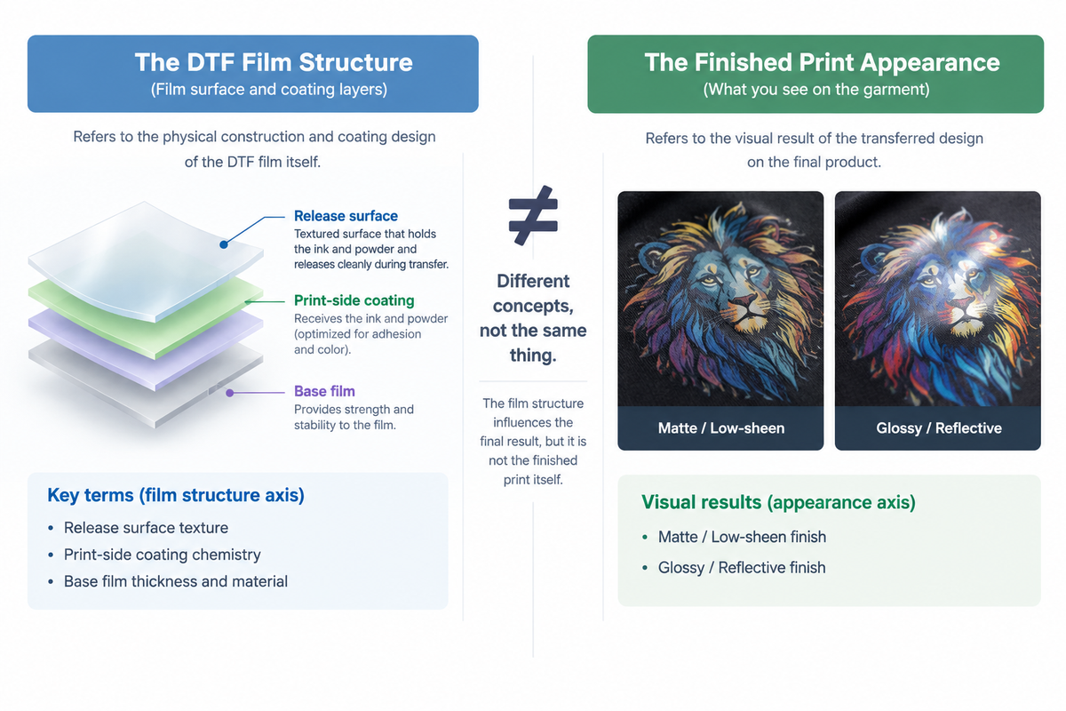
So when someone says a print "looks glossy," they mean the surface is smooth enough to reflect light cleanly. When they say it "looks matte," they mean that surface is textured enough to scatter it. That property comes from the top layer of the finished transfer — the surface the light actually hits — and that layer is not the carrier film. By the time the decoration is on a garment, the PET film that carried it has been peeled away. What remains is a layer made of cured ink and adhesive powder, and its surface is what anyone evaluating the print is looking at.
Does the film play any role at all? Some — and the mechanism is worth knowing, because it is the one real bridge between the two axes. During transfer, the ink-and-powder layer is fused while it is still in contact with the film's release coating. That coating has its own surface texture at the microscopic level, and the hot layer conforms to it: a smooth release surface leaves a smooth impression, a textured one leaves a textured impression. This is the same principle described in heat-transfer release technology, where the gloss of a transferred finish is set by how smooth or how textured the release surface it was cast against is — the finished surface is effectively the inverse of the release web. It is also why suppliers of transfer media define a matte grade of release coating by its micro-roughness and by how it scatters light, not by the color or the ink underneath.
So the film side is real, but it is one input into one layer — the outermost few microns of a stacked structure. And it is only one of several things competing to decide what that layer's surface ends up looking like.
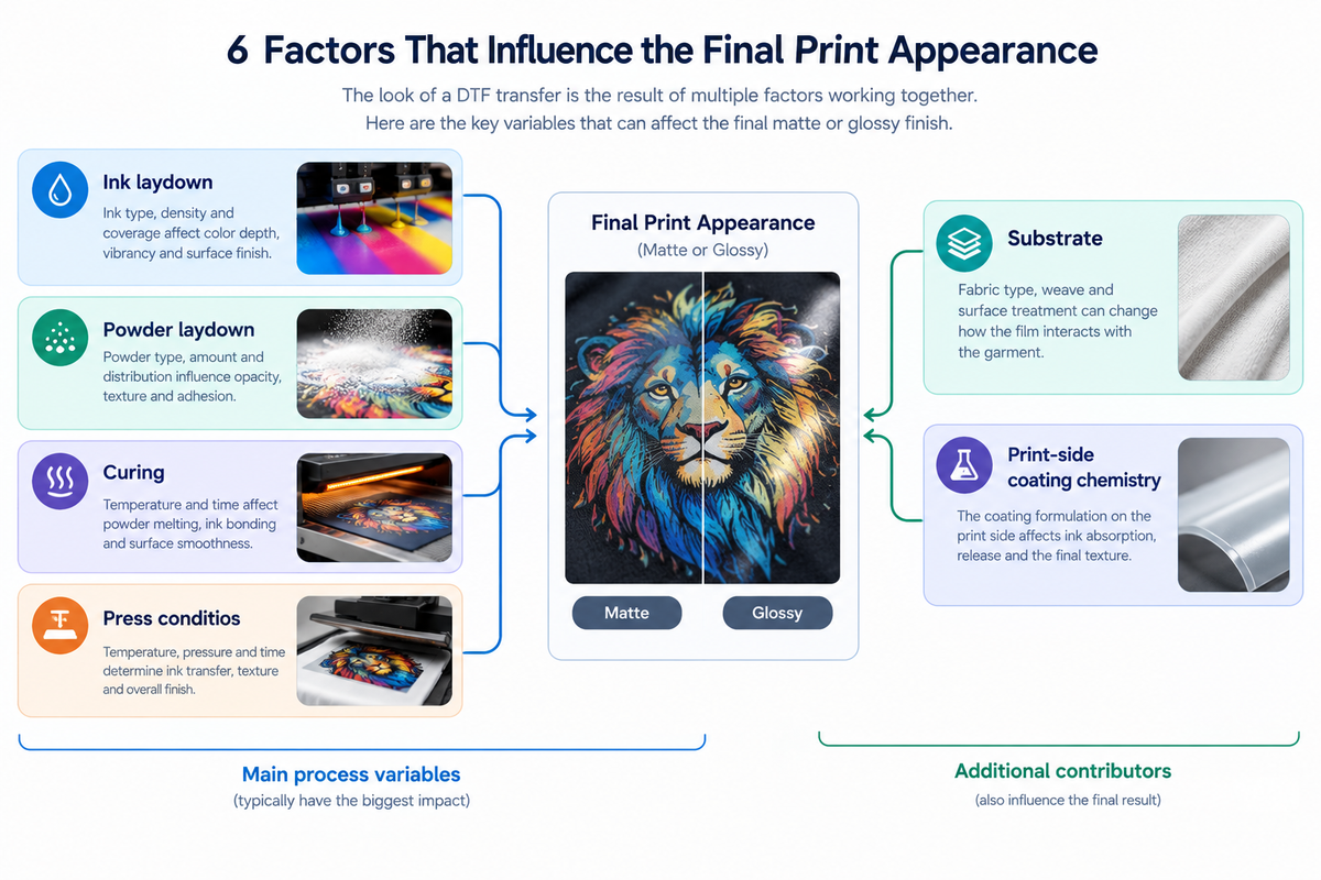
Here is what else is in that stack, roughly in the order they tend to matter:
Ink laydown. How much ink — especially white — goes down, and how evenly, changes the thickness and the surface regularity of the printed layer. Heavy, uneven laydown produces a lumpier surface that scatters light; tight, uniform laydown reads smoother.
Powder laydown. The adhesive powder that sits on top of the wet ink becomes part of the cured layer. Where the powder is applied unevenly or in excess, the finished surface reflects it.
Curing. Under- or over-curing changes how completely the powder melts and levels into the ink. A fully melted layer sits flatter; a partially cured one keeps more of its granular structure.
Press conditions. Temperature, pressure, and dwell time all reshape the surface while it is soft. A hotter, harder press smooths the layer out; a light, cool press preserves more of the texture it arrived with.
Substrate. Fabric texture telegraphs upward. The same transfer pressed onto a fine woven canvas and onto a coarse open-knit will not share a surface, because the layer above conforms to what is beneath it.
Print-side coating chemistry. The film's print-side formulation feeds into the laydown and how the ink sits on it, which is a different effect than the release texture, and a more indirect one.
Add those up and the honest ranking is the reverse of what a film label implies. Construction and release texture are real contributors, but they sit near the bottom of the list. The things that dominate what a finished print looks like are ink, powder, curing, and press conditions — the process, not the film.
Which is why a double-sided matte film does not automatically produce a matte print. It does not automatically produce a softer print either, or a richer one. The part of the word that would suggest otherwise is the part pointing at the wrong axis. Industry technical writing on this is unusually direct about it — a note on single versus double matte films from a DTF equipment maker puts it as "Single vs. double matte primarily changes how the film behaves while moving through production — not automatically how the finished transfer looks," and goes on to say the second surface treatment makes production more controllable rather than the print softer or shinier. Any appearance that follows is coming from the process, through the release-conformance mechanism above, not from the label.
The practical upside: everything that actually decides the look is a variable you control on your own line. You do not have to buy the right film to get the right finish. You have to set the process so the film's release contribution lands where you want it. If you want to go deeper on how the ink, the powder, and the film coating act on one another as a single system, that chain is covered in the film-ink-powder chain — worth reading once you have the two axes sorted, because it assumes you already know which one you are adjusting.
Why the two get mixed up
None of this is a conspiracy, and it is not just imprecise suppliers. There is a plain structural reason the terms slide into each other.
The word film in DTF is overloaded the same way matte is. Sometimes it means the carrier — the PET sheet that holds the print until it is pressed. Sometimes it means the coated medium as a whole, including the functional layers that make it behave a certain way on the line. A sentence like "use matte film" can therefore mean "use a film whose back coating will feed better" or "use a film that will give you a flat-looking print," and the sentence does not tell you which. Most catalog descriptions are written to cover both readings without committing, which is reasonable marketing and unhelpful specification.
There is a second, narrower confusion worth naming because it looks like a pattern. It is often said that hot peel produces a glossier finish and cold peel a matte one — in effect, that peel timing decides the look. There is a mechanical reason this correlation exists: a film's release layer has to be engineered for the peel window it is meant for, films built for cold peel commonly use a release layer with a matte texture, and the release texture is the one part of the film that does transfer into the finished surface as described above. So peel type and appearance are genuinely related in the market as it is actually sold.
But related is not the same as causal, and the two get written about as if cold peel = matte were a rule of the process. It is not. It is a correlation inside one vendor's film catalog. A cold-peel film with a smooth release coating would not produce a matte print just because it peels cold, and a hot-peel film with a textured release layer would not produce a glossy one. Meanwhile the site's own peel guidance treats finish as coming from the film's release surface rather than from the peel speed, which is consistent with the mechanism — but you will also find published tables elsewhere that state the mapping directly, and the honest read is that the industry is carrying two versions of this story at once. This article is not going to settle which one wins. What matters here is narrower: if you ever see matte used to mean "peel this way," you are looking at the construction axis again, borrowed to explain an appearance claim. That is the confusion in miniature. The peel side is covered in full in hot peel vs cold peel DTF film, where it belongs.
Where the appearance standard actually goes
Here is the decision all of this feeds into, and it is not a choice between two films.
If the appearance of a finished print is set by ink, powder, curing, and press conditions — with a smaller contribution from release texture — then an appearance standard written into a film specification is written in the wrong place. A spec that says "matte film" specifies an input that influences a fraction of the outcome, and leaves the dominant variables unstated. Whoever is checking the work then has nothing to check against.
The standard belongs in three places instead, and only one of them is about the film:
| Where the standard lives | What it states | Why it goes there |
|---|---|---|
| Film specification | Coating structure (single- or double-sided), back-side treatment, format and width | This is what the film actually controls: how it runs. Specify it for feeding and static, not for look. |
| Process parameters | Ink laydown, powder application, cure schedule, press temperature, pressure, and dwell | This is where appearance is actually decided. A number can be written down, repeated, and audited. |
| Acceptance sample | A physical pressed sample, signed off against a defined reference | The only artifact that captures the whole stack at once. This is what a client accepts against, and what you re-check a new film batch against. |
The order matters. Most shops write the first row and inherit whatever the last row happens to be. The appearance they end up shipping is an accident of the process settings nobody wrote down.
There is one more reason the first row is shorter than people expect. A film specification is a narrow document by design: it can name a coating structure, a back-side treatment, a width, and a format. It cannot name the ink, the powder, the cure, or the press, because those are not properties of the film. If you want the full set of construction and format options a supplier actually stocks, complete DTF film specifications show the same limit: the specification tells you how the film behaves, and stops there.
There is a small practical test that belongs in this conversation, because the most common variant of the mix-up is a real one: when a film is treated on both sides, it is easy to assume you can tell the print side by feel, since "matte" sounds like it should be easy to spot. You cannot reliably tell by touch, and neither side being matte means either side is printable. The print side is the one carrying the heavier ink-absorbent coating — usually the rougher of the two — and a quick check is to run a drop of water across the surface: the print side wets and spreads, the treated back side does not take it the same way. Failing that, the edge of a marked roll or a note on the box is faster than guessing — DTF film sheets states the same thing for pre-cut stock, where the rougher, specially coated face is the one to print on. If you are setting up a machine and unsure which side faces the head, that is a different article — DTF film and printer compatibility covers the setup.
If you are in the middle of writing that spec and you are not sure whether the film you have in stock is behaving like the construction it was sold as, the useful next step is to test a section against your current process rather than trust the label. A sample you press yourself, at your settings, will tell you more about the appearance you will ship than any catalog description. If that is the situation you are in, the practical route is to request a sample, which settles the film side of the question in your own workflow instead of in a comparison table.
When the choice does not exist
One last boundary, because not every shop ever faces the two-word mix-up in the first place.
If you run a single film across all your work — one construction, one set of process parameters, one acceptance sample — then the ambiguity never bites. There is no second option to confuse the first with, and the standard lives where it should because there is only one place to write it. A shop that has standardized on one double-sided matte film and tuned its process around it has effectively dissolved the problem by refusing to treat the label as a decision.
The mix-up arrives when a shop starts carrying more than one film, or starts buying against a client's verbal description, or hands a spec sheet to a new supplier. That is when a word doing two jobs becomes a real cost. Until then, it is a definition, not a decision.
Three lines to write down
This is not a decision between two films. It is a decision about which document your appearance standard lives in.
So write these three lines and put them where your production team can find them:
On the film spec — coating structure, back-side treatment, width and format. One row, describing how the film runs.
On the process card — ink laydown, powder application, cure schedule, press temperature, pressure, and dwell. This is the row that decides the look.
On the acceptance sample — the pressed reference the client signs off against, and the artifact every new film batch is compared to.
A film named matte does not promise a matte print. Your process does. Write it down in the place that owns it — and the next time someone asks you for "matte DTF film," you will know which of the two things they mean, and whether it is even the thing they need.
FAQ
Does the film finish decide the finished print's look?
Does double matte film print softer or more matte?
If both sides are matte, how do I know which side to print on?
Is matte better than glossy for dark garments?
Does glossier film last longer in the wash?
Can I change the look after pressing?
Contact Us
Tell us your requirements and our team will get back to you within 24 hours.

Ellen Lin
Product Manager & Heat Transfer Materials Specialist
Ellen Lin is a Product Manager at LorinTransfer, specializing in heat transfer materials, DTF printing solutions, and UV DTF transfer products. With hands-on experience in product development and market research, Ellen works closely with manufacturing teams and printing professionals to improve product performance, application methods, and customer solutions. She shares insights on transfer printing technologies, material selection, and industry trends to help businesses make better decisions for their printing projects.
Related Articles
Can You Use DTF Film in a Sublimation Printer? Honest Answer
You already own a sublimation printer. A customer wants a vivid print on a black cotton tee, and you want to know whether direct-to-film (DTF) film can get you there without a second machine.
DTF PET Film Explained: Structure, Types & Buying Guide
Almost every DTF film listing you open says the same thing in the spec line: PET.
Glitter & Specialty DTF Films: Types, Uses & Buying Guide
Glitter DTF film pulls about 170 US searches a month. Glow-in-the-dark follows at 90, and reflective at 50 (Lorin Transfer keyword research, Google Ads data, Oct 2026).